AZADE VAKILI
Indeed Flex is a mobile platform connecting job seekers with flexible work. I worked on improving key parts of the user experience, including onboarding, support, and worker performance systems, focusing on reducing friction and increasing transparency.
MY ROLE
UX/ UI designer
PLATFORM
iOS/ Android app
CLIENT
Indeed Flex
YEAR
2024-2025
CONTRIBUTION
DELIVERABLES
-
Ideation
-
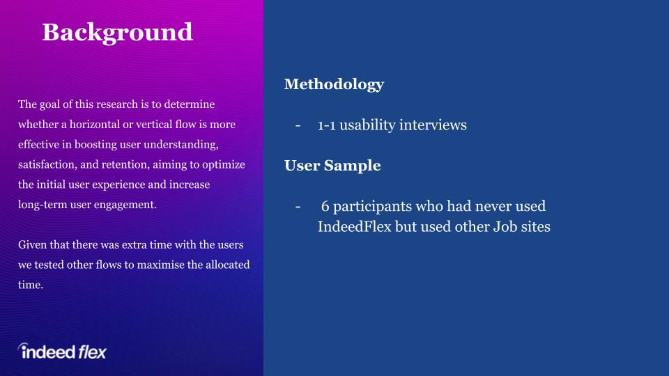
Research and User Testing
-
User flow, Sketching
-
Wireframes, prototype
-
Interaction design
-
Mapped end-to-end user journeys for job search, application, and shift management
-
Designed low- and high-fidelity wireframes for core app flows
-
Created interactive prototypes for testing booking and scheduling features
-
Conducted usability testing to validate navigation, search, and booking processes
-
Defined a component library in collaboration with the UI design team for consistency
-
Delivered design specifications and assets for developer handoff
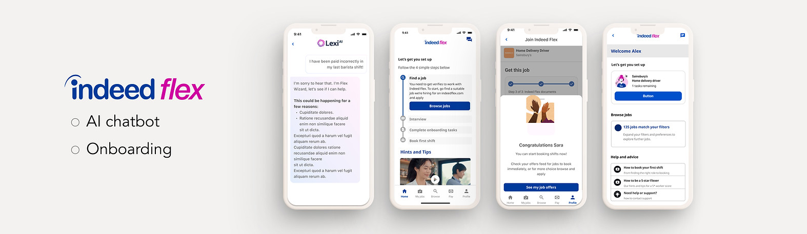
Project 1 : ONBOARDING PROJECT OVERVIEW
When I joined Indeed Flex, the onboarding process for new users was long, inconsistent, and prone to drop-offs. This created friction for job seekers eager to start booking shifts quickly. My role was to identify pain points, streamline the process, and create a more cohesive, intuitive flow that balanced compliance requirements with speed and clarity.

RESEARCH
Insights:
Research revealed that users were overwhelmed by the number of steps and lacked visibility into their progress, leading to drop-offs during onboarding.
Impact:
Grouping steps logically and introducing progress indicators reduced abandonment by 40%, significantly improving onboarding completion rates.


FINAL DESIGN


Project 2 : AI CHAT PROJECT OVERVIEW
With the current chatbot setup, all questions follow the same process regardless of whether Lexi can answer them or not. A Flexer submits a query on the initial screen, is directed to the Lexi chat, and, if needed, eventually reaches SF Ops support. When Lexi doesn’t have the answer, this creates unnecessary steps and a frustrating user experience. The system needs to intelligently route users to the right support channel based on their question type to save time and reduce friction.
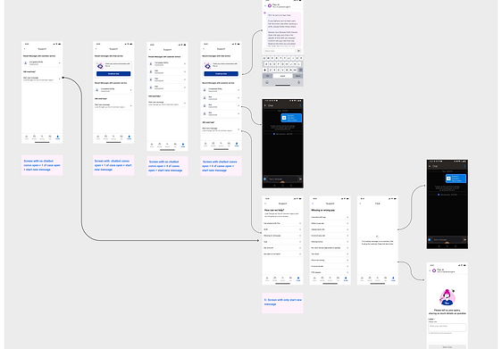
The entry point was redesigned to start users directly in the Lexi chat, ensuring the router worked throughout the conversation and removing redundant steps. A friendly welcome message introduced Lexi as the AI support agent, while smart routing rules controlled when the “Chat with Team” option appeared. This reduced unnecessary steps and ensured users were routed to the right support channel faster, improving efficiency and reducing frustration


Project 3: CLIENT PORTAL
In addition to the mobile app, I also worked on the client portal, where my role involved designing web-based tools for employers to manage jobs, shifts, and workers. This meant balancing the needs of two user groups—job seekers in the app and employers in the portal—while ensuring a consistent experience across platforms. My work spanned both app design and web portal design, allowing me to create cohesive flows that connected the candidate and client sides of the product.

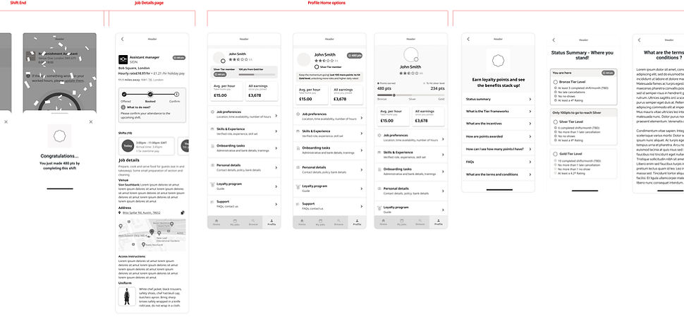
Project 4: Status program
-
The Problem: Workers were often confused about why they received strikes and how to "work them off."
-
The Goal: Provide a transparent, real-time dashboard that clearly communicates strike status, reasons for penalties, and a clear path to "redemption" (strike-free shifts).
To kick off the project, I led collaborative brainstorming sessions with product managers and stakeholders to align the strike policy with a transparent user experience. We rapidly mapped out the "Strike Deactivation" journey to identify technical constraints and friction points early on. This collaborative foundation ensured that the high-fidelity evolution remained rooted in both technical feasibility and user empathy.


Lo-Fidelity Wireframes to High-Fidelity Prototypes
I adopted an iterative process, beginning with low-fidelity wireframes to map out the complex user journey of the Strike & Ban program. This allowed for rapid structural changes before moving into high-fidelity design.
High-Fidelity Testing & Feedback
The Positives: Validating the Vision
-
Intuitive Navigation: 100% of participants successfully located their strike status, validating the information architecture established in the wireframes.
-
Motivational Progress: Participants reacted positively to the "tick" system for shift deactivation, noting that it made the path to a reset feel achievable.
-
Policy Engagement: Users preferred the short, bulleted policy summaries and video options over traditional long-form legal text.
The Friction: Areas for Pivot
-
Icon Ambiguity: 4/5 participants misinterpreted a "clock" icon as a manual review status, leading to confusion about when a strike would actually disappear.
-
Information Mismatch: Testing revealed that users prioritized the reason for a strike over the client name, requiring a redesign of the strike detail cards.
-
Dispute Loop: Users often clicked "Open a Dispute" simply to find more details about their strike, indicating that the initial status cards weren't descriptive enough


Result
-
Gamified Retention: Introduced "MyFlex" tiers (Starter, Silver, Gold) to encourage high performance and reliability through a visual progression system.
-
Actionable Transparency: Simplified complex performance metrics—such as Five Star Ratings and No-Shows—with clear color indicators (Green/Red) to provide instant feedback on account standing.
