
Designing feedback for a workout you can't stop to look at
Duofit is a subscription-based smart fitness assistant: a smart ball and a companion app that coach people through exercise at home. I designed how the device and the app guide, respond to and motivate the person, so they keep moving instead of reading a screen.
COMPANY
Chelsea FC
MY ROLE
UX/UI Designer
PLATFORM
iOS
TIMELINE
9 months · 2020
WORKED WITH
Product managers, movement experts, engineers, hardware teams and a UI designer
What I owned, and what I shared
Duofit crossed a device, an app and a workout, so most decisions were shared. This is where my work sat.
I OWNED
The experience across device and app
Research and discovery. User journeys across the device, the app and the workout. The interaction flows between the smart device and the app. Wireframes from low to high fidelity, usability testing, and the improvements that followed.
I SHARED
Decisions that needed other experts
Light and sound cues with the hardware team. Exercise guidance with movement experts. Feasibility with engineers. Visual styling and accessibility with collaboration with the UI designer.
01 · The opportunity
A market need and a futuristic idea: a coach you can hold, and accurate results afterwards
Duofit started from two things at once: a need in the market and a futuristic idea. The idea was a smart ball that coaches people through touch and voice while they move, and an app that shows accurate results at the end. At home there's no coach in the room. Without real-time feedback on form, accountability, or a signal that effort is paying off, people drift into inconsistency or get hurt repeating an exercise nobody corrects.
THE EXERCISER
Structure and feedback, without a trainer
They train alone and want guidance without the cost or commitment of a personal trainer or gym. They're comfortable with some tech, but only if it stays out of the way.
THE PRODUCT
Guidance that fits inside a rep
The experience had to feel motivating, not intrusive, and help without interrupting the physical flow of the workout. Device and app had to work as one.
THE DESIGN CHALLENGE
How might we coach someone through a workout when their hands are full, their eyes are busy and no one is in the room?
Three things shaped every decision: 1. While exercising, hands and eyes are busy, so people can't read a screen. 2. Feedback has to come straight away, while they are still moving. 3. It should encourage people, not nag them.
02 · Research
People wanted instant, simple feedback they could feel and hear
I led the research. I used four methods so that no single source decided the design: 10 interviews, a survey with about 50 replies, 10 hours observing people in a gym, and a review of products already on the market.
10
Interviews with potential users and trainers
I spoke with people who train alone and with trainers who coach in person, about what they expect from smart sports products and what a good coach does that a device doesn't. People expected a smart product to just work: quick to set up, quick to start, and clear about what it is doing. Trainers added that a good coach says little, but at the right moment.
~50
Survey replies, from 100 sent
About half replied. I used the survey to test at a wider scale what people expect from smart sports products, from set-up to features. The replies backed up the interviews: people wanted products that are simple and work straight away more than extra features.
10 hr +
Observing and talking to people in a gym
I watched people train and talked to them as they did, to see how they really move and what they do when they need help. People rarely looked at their phone mid-set. They checked it between sets, if at all.
Market
A review of what already exists
A broad look at smart products in sport, including Peloton, to see what they promise, how they feel to use and where they fall short for someone training alone at home. Peloton, Mirror and Tonal, among others. Most lean on a screen, which doesn't work when your hands and eyes are busy.
What i found
What it told us: people want smart products to be simple and to work straight away, they want feedback while they move without having to look at a screen, and they like physical, hands-on interaction.

03 · Defining the experience
One experience across three parts: the device, the movement system and the app
I worked with product managers, movement experts and engineers to agree what users needed, what the technology allowed and what the business wanted, before any screen was drawn.

01
The device
A smart ball that people hold, move and throw. It speaks through touch, light and sound.
02
The movement system
The exercises and the guidance that tells people how to do them.
03
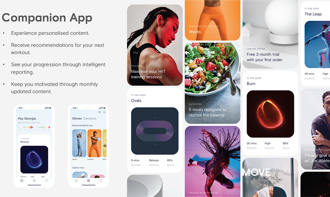
The companion app
Setup, workouts and progress. It supports the ball and never competes with it.
Defining the ball
Before I designed how the ball speaks, I worked with the engineers and stakeholders to agree what the ball is and what it can do. Engineers told us what the hardware could sense and signal. Stakeholders set what the product needed to achieve. My part was to turn both into what a person feels in their hands: what the ball can say, and when.
Voice: the idea was to use Alexa voice technology so the ball could guide people out loud, hands-free, instead of asking them to look at a screen.

How the device speaks
Touch
Short taps for moments like a catch. Sustained vibration for something that continues over time.
It reaches the hands, which are already on the device.
Light
Shows device state at a glance, such as connected or ready.
Seen in peripheral vision, with no need to stop.
Sound
Confirms actions and marks moments in a workout.
Works when the person is not looking at the device.
Voice
Prompts that guide an exercise step by step.
Lets people follow along without reading.


Designing each exercise with a trainer
I worked closely with a trainer to design the full experience for every exercise. For each one we decided what the person does with the ball, what the device tells them through touch, light, sound or voice, and what the app shows before and after. We always designed the three parts together, so the movement worked first and the app only supported it.


04 · Device journey
Start, control and finish a session without looking at a screen
I designed the end-to-end journey for the physical device, from onboarding to daily use. That covered how people engage with the smart ball through touch, motion, haptic feedback and voice prompts. I worked with the hardware team so each interaction (charging, syncing, exercising) was intuitive and backed by LED cues and audio signals. The goal was for the ball to feel like a natural part of the workout, working smoothly with the app and the movement routines.


05 · The companion app
Task flow
To support a seamless user experience, I created a detailed app task flow that maps out key user actions, from onboarding and device pairing to starting a workout and tracking progress. This flow helped identify critical touchpoints, reduce friction in navigation, and make sure each step logically supports the user's goals. It was the foundation for designing intuitive screens and interactions that fit both the physical device and the movement system.


Low-fidelity wireframe design
I explored layout, hierarchy and core function in low-fidelity wireframes first. That let the team test workout selection, device pairing and progress tracking quickly, before any visual styling.


06 · Subscription flow
Asking for payment after the first win, not before it
Fitness apps have a trust problem. Show the paywall too early and it reads as bait-and-switch. Wait too long and you lose the moment motivation peaks. The real question was when someone has enough evidence to want to pay, and how to make that moment obvious without interrupting it.
01
Let the free experience sell
The free tier gave people a real taste of the core loop: pairing the device and finishing a guided workout. Comparison cards showed the premium benefit right after that first win, when curiosity was highest.
02
One screen, one choice
I split the journey into clear steps to cut cognitive load, with transparent pricing and a highlighted recommended plan to support the decision.
03
Checkout is a step, not a destination
Payment only appeared once intent was clear. Afterwards people landed straight back in a workout or onboarding, never on a dead-end confirmation screen.


07 · User testing
test sessions showed where people got lost between the ball and the app
I ran a couple of test sessions with a low-fidelity prototype and a demo ball. The demo ball wasn't really connected, so I asked people to pretend it was and watched how they moved between the ball and the app. Testing this early meant the problems cost a sketch to fix, not a hardware change.
ON THE BALL
WHAT I TESTED
Pairing, gesture recognition and haptic feedback.
WHAT I SAW
With no real connection, people looked for a sign that it was connected and found none.
WHAT I CHANGED
Planned clearer light signals and audio cues for the final ball. Feedback also refined how responsive and intuitive the physical interactions felt.
ON THE APP
WHAT I TESTED
Onboarding, workout navigation and progress tracking.
WHAT I SAW
First-time users asked for clearer guidance.
WHAT I CHANGED
Added an interactive tutorial and voice-assisted instructions. Adjusted navigation and feedback loops to reduce friction.


08 · High-fidelity design
A reusable component system that kept prototyping fast
I designed the UI together with the UI designer, and we built the component system as a pair. I led how each component behaves, including its states and feedback, and I worked on the visual design alongside them. We shared styling and accessibility. One system meant prototypes were quick to change and every screen stayed consistent.


09 · Final designs and what I learned
Ready for handoff, then shelved, with a lesson that stayed
The design was tested, refined and ready for engineering. The project was shelved in 2020 when COVID-19 disrupted the hardware roadmap.


Every handoff must be invisible
Syncing a physical device with an app only works if people never notice the handoff between them. This shaped how I approach connected-device products since.
Use more than one channel
When people can't look, feedback has to arrive through light, sound or touch. Any one of them can be missed.
Test the unglamorous moments
Connection, first use and set-up decided whether people trusted the product, long before the workout itself.


10 · If I had more time
What I'd do next
These are next steps I would take, not work I've done.
01 . TEST IN A REAL HOME
Check voice guidance where people actually train
Living rooms are noisy and people move around. I'd test whether voice prompts are heard and understood at a distance, and whether light and sound still work together.
02 ·MEASURE THE SUBSCRIPTION FLOW
Find where people leave
Compare how many reach the comparison cards, choose a plan and complete checkout, and test the timing of the first prompt.
03 . INCLUSIVE FEEDBACK
Make sure no one is left out
Check that every key signal reaches people who can't see or can't hear it, by using at least two channels for anything important.
